Hi. I’m Adriana, a multi-disciplinary designer with an integrative approach to brand identity and user experience.
What I do
UX design
Graphic design
Drawing & painting
Illustrations
Consulting
Drop me a line
hello@adritha.com
Case Study: NobleEats App UX Design
Project Overview
Many of us get enthusiastic about going out to eat and trying new locations and new foods, right? I often had the surprise to see that many of the highly rated restaurants are affected by the lack of personnel or the poor education of the existing employees.
NobleEats App offers a solution just for that, for improving the customer experience in the Noble restaurant first, and then in the restaurants all over the world.
The problems
Long waiting time for dine-in and take-out / pick-up orders
Difficult to spot food allergens in the menu
No information on the nutrients and calories
Long waiting time for the check/bill after finishing the meal
The goal
Improve the ordering process
Reduce the waiting time for dine-in and take-out orders
Show detailed information in the menu (allergens, calorie count, ingredients, nutrients)
Have an online payment system
Understanding the user
I conducted research on a 12 people sample. I chose people that visit the Noble Restaurant for lunch and dinner on a weekly basis at least.
My research method was mainly through surveys – I have printed out multiple copies of a 10 open-ended questions survey and I have handed it to people in the restaurant that wanted to participate.
I have also based my research on observation, spending quite a few hours at the location and watching how things actually happen: the order flow, the chats with the waiters, the payments etc. and tried to identify the main user pain points.
Pain points
Long waiting time
Many customers stated that sometimes they wait a long time for the food to arrive. This happens for both dine in and take away orders. They also mentioned that it would be useful for them to know the preparation time in advance.
Not enough information
A few customers with food allergies and intolerances mentioned that they find it difficult to find information about the ingredients and allergens and they have to ask the waiters all the time. A few ladies that are on a diet would love to see the calorie count of items.
Incorrect requests
A few participants reported that they sent some remarks and special requests for the chefs via the waiters, but they got the items wrong anyway.
Waiting too long for the bill
Multiple customers mentioned that they usually want to leave the restaurant quite fast after finishing the meal, and they often spend too much time waiting for the waiter to bring the check and to process the payment.
Personas will help us create designs that speak directly to users, and the users will have the best experience using our product.
I started with some paper wireframes. This is a fun step in the design process, though not mandatory. It’s definitely faster: it conveys many ideas in a short time and there’s no wrong way to approach it.
The image on the right illustrates multiple versions of the home screen, with various layouts, plus the refined, final version with a red border.
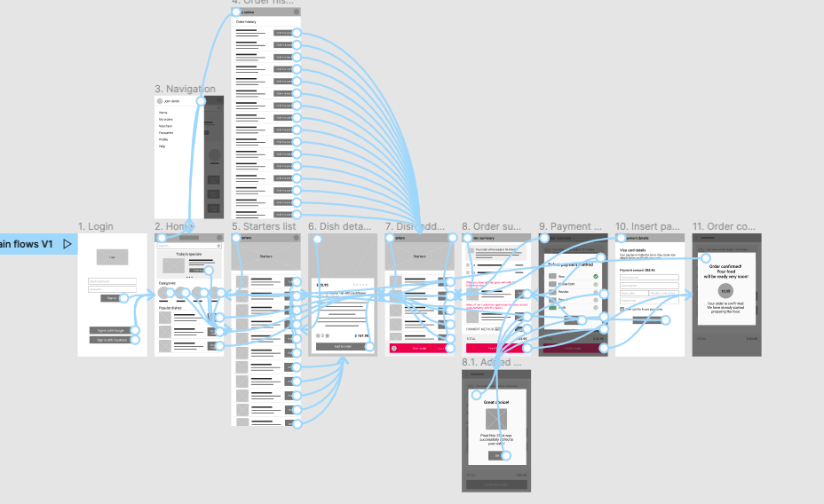
Low-fidelity prototype
After having fun with the paper wireframes and establishing the main user flows, I built the digital wireframes and added a bit of interaction to create the low-fidelity prototype.
This first prototype went through the first round of usability testing, which helped me inform the refining process and make the best design choices.
Usability testing
have performed 2 rounds of usability testing: the first usability study helped with the transition from wireframes to mockups, and the second one offered insights that helped me with flow optimizations and UX improvements in the final phase of the UX process.
These are the findings of the second study:
Multiple login options
Users want to have easy ways to login, via third party services, like Google and Facebook; without the need to create an account and log in with username and password.
Difficult to find the Search
About half our participants spent quite some time looking for the search input on the home screen of the app.
Special requests popup intrusive
All the participants were annoyed and frustrated with the Special request/Comment popup that showed up every time an item was added to the Order.
Color palette improvements
Reconsidered the color palette and chose other colors, that are more in line with the specific of the app and the target audience.
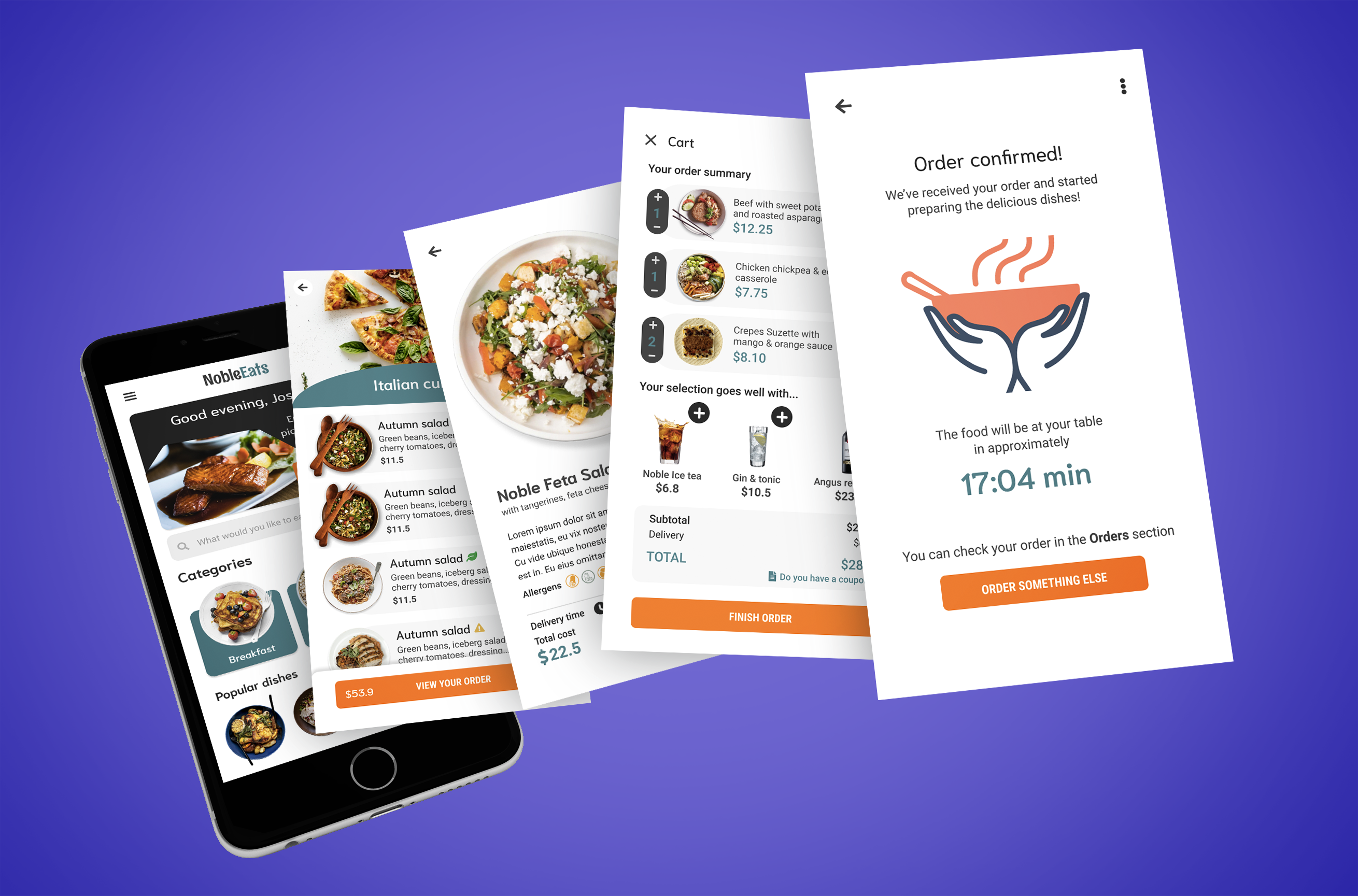
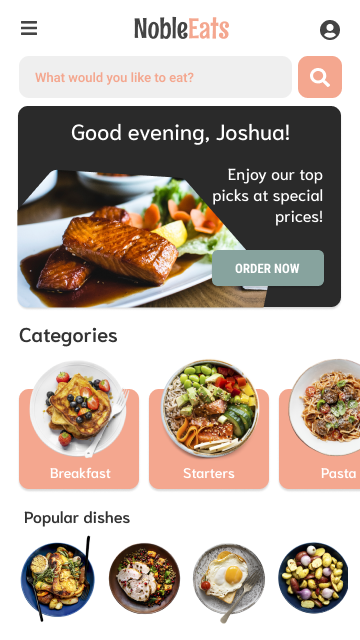
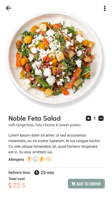
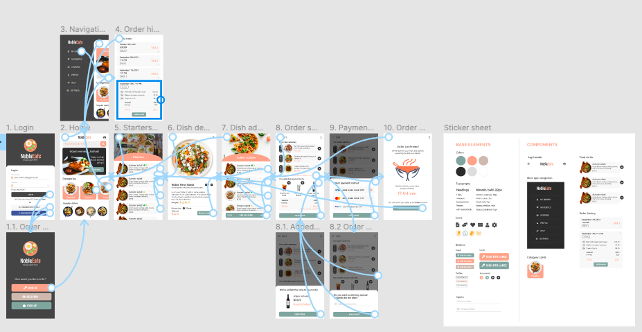
Key mockups
Listing some of the key high fidelity mockups below.
High-fidelity prototype
Visit this link to play with the high-fidelity prototype.
Accessibility considerations
I’ve built this product with the usability and accessibility in mind:
The navigation is clear and consistent
Interactive elements are easy to find and placed in strategic areas of the app - search input, Suggestions section in the cart etc.
The content is grouped using headings and whitespace
The color contrast is sufficient and the color palette is suited for the purpose of the product
The product is compatible with all the screen readers
Takeaways
As the technology evolves and all industries are going through digital transformation, being able to order at restaurants via technology has become common sense. Customers want to spend as little time as possible ordering and searching for information and more time enjoying the company and the food.
I have designed this product having the customer first in mind, with their needs and frustrations, and I can definitely see it in all restaurants in the future, as part of a great ordering experience.
Next steps in this pursuit include adding more features that improve the user experience and also creating a base application that can be customized for each restaurant that wants to use it.